

What Is Responsive Web Design? A Complete Beginner's Guide
In today's digital world, people access websites using smartphones, tablets, laptops, and desktop computers. A website that looks great on one device but breaks on another can drive visitors away and hurt your search engine rankings. That's why Responsive Web Design (RWD) has become an essential part of modern web development.
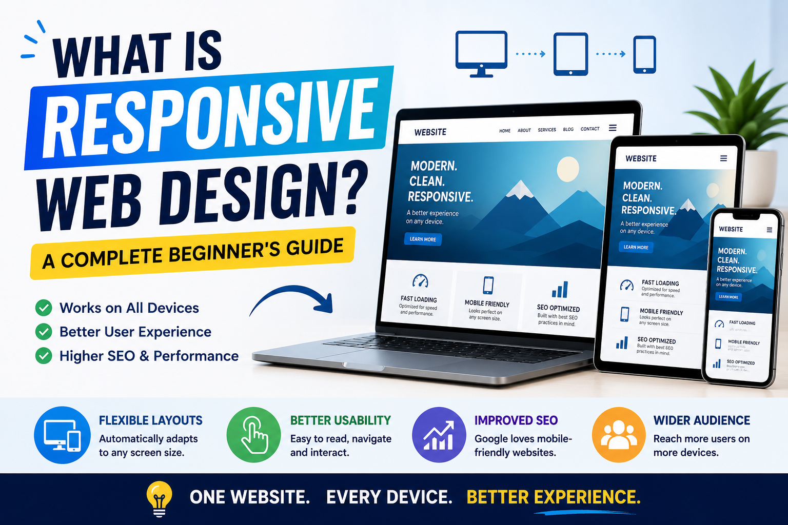
What Is Responsive Web Design? A Complete Beginner's Guide
Introduction
In today's digital world, people access websites using smartphones, tablets, laptops, and desktop computers. A website that looks great on one device but breaks on another can drive visitors away and hurt your search engine rankings. That's why Responsive Web Design (RWD) has become an essential part of modern web development.
This guide explains what responsive web design is, why it matters, how it works, and the best practices for building websites that deliver an excellent user experience on every screen size.
What Is Responsive Web Design?
Responsive Web Design is a web development approach that allows a website to automatically adjust its layout, images, and content based on the user's screen size and device.
Instead of creating separate websites for desktop and mobile users, a responsive website uses flexible layouts and CSS media queries to provide a seamless experience across all devices.
Key Features of Responsive Web Design
- Mobile-friendly layouts
- Flexible grid systems
- Responsive images
- CSS media queries
- Fast loading performance
- Consistent user experience
Why Responsive Web Design Is Important
Responsive websites benefit both users and businesses.
1. Better User Experience
Visitors can easily read content, navigate menus, and interact with your website regardless of their device.
2. Improved SEO
Search engines favor mobile-friendly websites. Responsive design helps improve visibility in search results and supports better rankings.
3. Higher Conversion Rates
A smooth browsing experience encourages visitors to stay longer and complete desired actions such as making purchases or submitting contact forms.
4. Easier Website Maintenance
Managing a single responsive website is more efficient than maintaining separate desktop and mobile versions.
How Responsive Web Design Works
Responsive design relies on several core techniques:
Flexible Grid Layouts
Grid systems use relative units such as percentages instead of fixed pixel widths, allowing content to adapt naturally to different screen sizes.
CSS Media Queries
Media queries apply different styles depending on the device's screen width, orientation, or resolution.
Responsive Images
Images automatically resize and scale to fit different screen sizes without reducing quality.
Flexible Typography
Text sizes adjust proportionally to improve readability on every device.
Best Practices for Responsive Web Design
Follow these best practices to create an effective responsive website:
- Design with a mobile-first approach.
- Use flexible CSS layouts.
- Optimize images for faster loading.
- Make buttons large enough for touch interactions.
- Test your website on multiple devices and browsers.
- Improve page speed by reducing unnecessary scripts.
- Use readable fonts and proper spacing.
Common Mistakes to Avoid
Avoid these common responsive design mistakes:
- Using fixed-width layouts
- Ignoring mobile users
- Large, unoptimized images
- Small buttons and links
- Poor navigation on smaller screens
- Slow loading pages
- Not testing across devices
SEO Benefits of Responsive Web Design
Responsive design supports SEO by:
- Improving mobile usability
- Reducing bounce rates
- Increasing page speed
- Simplifying website indexing
- Enhancing user engagement
- Providing a consistent URL structure
Frequently Asked Questions (FAQs)
What is responsive web design?
Responsive web design is a method of building websites that automatically adapt to different screen sizes and devices.
Why is responsive design important for SEO?
It improves mobile usability, page speed, and user experience, all of which contribute to stronger search engine performance.
What technologies are used in responsive web design?
Developers commonly use HTML5, CSS3, Flexbox, CSS Grid, media queries, and responsive images.
Is responsive web design better than a separate mobile website?
Yes. A single responsive website is generally easier to maintain, provides a consistent user experience, and supports better SEO.
Conclusion
Responsive web design is no longer optional—it's a core requirement for modern websites. By creating layouts that adapt seamlessly across devices, you can improve user experience, strengthen SEO, and increase engagement. Whether you're building a personal blog, business website, or eCommerce store, investing in responsive design will help ensure your site remains accessible and effective for every visitor.


-Photoroom.png)